
.webp)
Why Visual Consistency Is a Luxury Brand’s Secret Weapon
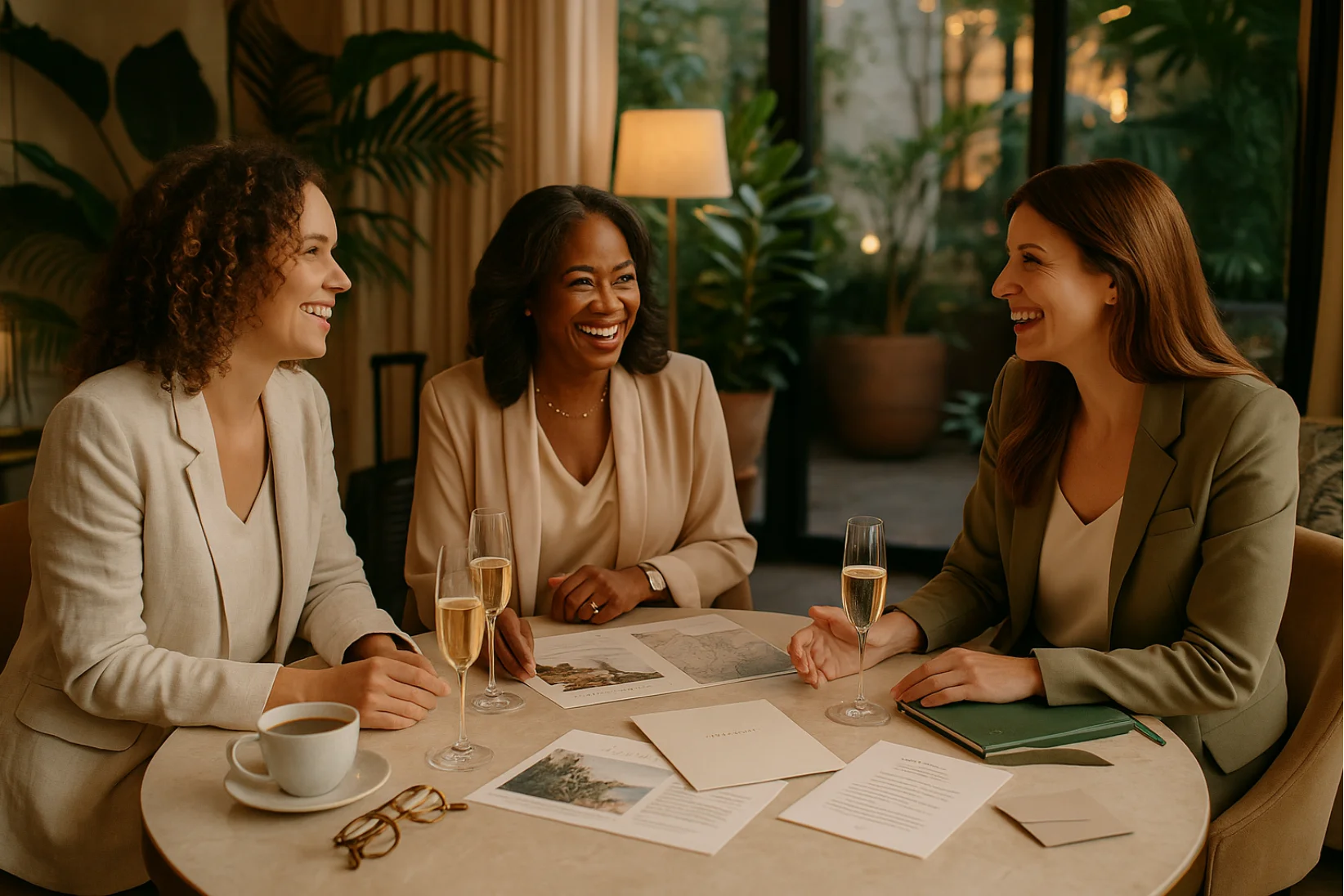
Let’s start with a real-world example: Consider a brand like Aman Resorts. Whether you see their Instagram feed, browse their website, or receive one of their emails, you’ll notice the same calming color palette, understated typography, and serene photography style. This consistency creates an instant emotional connection and immediately communicates luxury, trust, and refinement.
In the luxury travel space, every visual impression sends a message. Whether it’s your website, Instagram grid, email header, or client proposal—what people see needs to immediately communicate trust, quality, and intentionality.
Consistent visual branding builds familiarity, which leads to recognition, and ultimately trust. When your audience sees cohesive design elements across platforms, they intuitively understand that your business is polished, professional, and reliable.
In this entry, we’ll explore how and why consistency matters, where to apply it, and how to make sure your visual identity supports your larger brand goals.
What Does Visual Consistency Actually Mean?
Let’s break it down with a simple Q&A format:
Q: What is visual consistency in branding?
A: Visual consistency means your brand looks, feels, and behaves the same across all touchpoints—whether someone finds you on Instagram, your website, or opens a PDF proposal.
Q: Does that mean everything should look exactly the same?
A: Not exactly. It means your visuals should be recognizably you—with a consistent logo, color palette, typography, and image style.
Q: Why does it matter?
A: Because consistency creates familiarity. Familiarity builds recognition. And recognition builds trust—especially in luxury markets where visual cues matter.
Q: What should be consistent?
- Logo and logo variations (for dark/light backgrounds)
- Brand color palette (same hex codes, used with intention)
- Fonts and typography hierarchy
- Image style (lighting, color tone, subject matter)
- Layouts, spacing, and alignment across platforms
Think of your visual brand like a language—when you speak it fluently and consistently, your message is unmistakable.?
Visual consistency means that your brand looks and feels the same across every digital and physical touchpoint. It doesn’t mean being repetitive—it means being recognizable.
This includes:
- Using the same logo, color palette, and fonts everywhere
- Maintaining a consistent photography and imagery style
- Aligning layout and design structure (spacing, hierarchy, icons)
- Ensuring brand elements are adapted appropriately across formats (mobile, print, desktop, etc.)
Think of it as your brand’s visual language. The more fluently and consistently you speak it, the more clearly your message is received.
Why It Matters More in Luxury Travel
Luxury clients are deeply visual—they’re attuned to detail, aesthetics, and polish. Inconsistent visuals can cause confusion, dilute your credibility, or even make your brand feel untrustworthy.
Client Scenario: Imagine a high-end traveler researching two travel advisors. One has a refined, consistent look across their Instagram, proposal PDFs, and website—sleek fonts, a clear logo, and a consistent tone in imagery. The other uses different fonts on every platform, mismatched photo styles, and inconsistent layouts. The first immediately feels more trustworthy and high-value, even if the offerings are similar.
Visual cohesion can:
- Instantly elevate perceived professionalism and value
- Create emotional alignment between your client and the experience you offer
- Differentiate you in a saturated market by reinforcing your signature style
This isn’t just about "looking nice." It’s about creating the kind of brand presence that clients instinctively trust and feel drawn to.
Luxury clients are deeply visual—they’re attuned to detail, aesthetics, and polish. Inconsistent visuals can cause confusion, dilute your credibility, or even make your brand feel untrustworthy.
In contrast, visual cohesion can:
- Instantly elevate perceived professionalism and value
- Create emotional alignment between your client and the experience you offer
- Differentiate you in a saturated market by reinforcing your signature style
This isn’t just about "looking nice." It’s about creating the kind of brand presence that clients instinctively trust and feel drawn to.
Where to Apply Visual Consistency
Visual consistency should be applied across all touchpoints where your brand shows up. Use this checklist-style grid to quickly evaluate where and how you can maintain brand alignment:
(Insert Table)
Use this table as an internal reference whenever you're updating or creating brand materials to ensure alignment across every client-facing channel.
A few key areas where consistency pays off big:
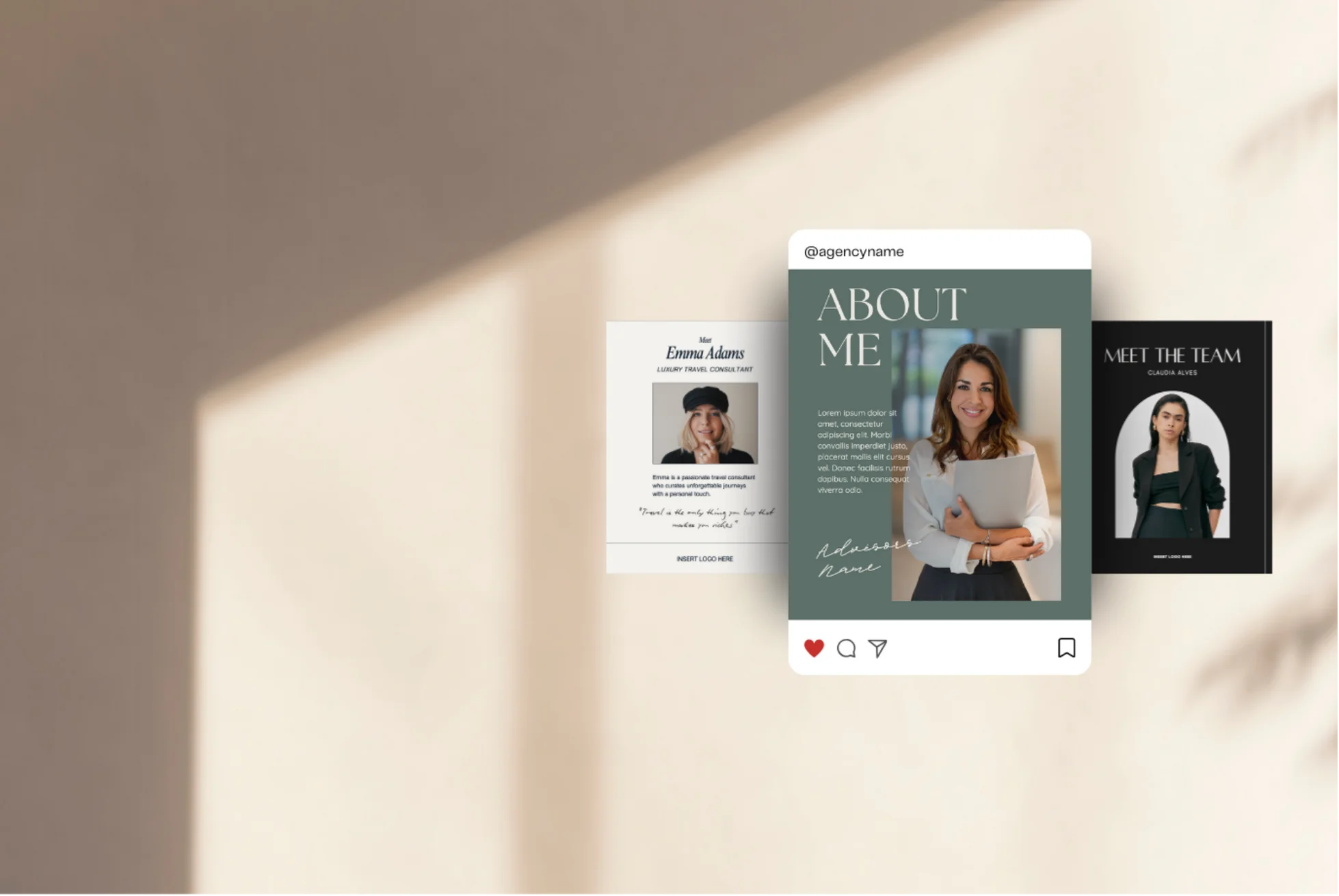
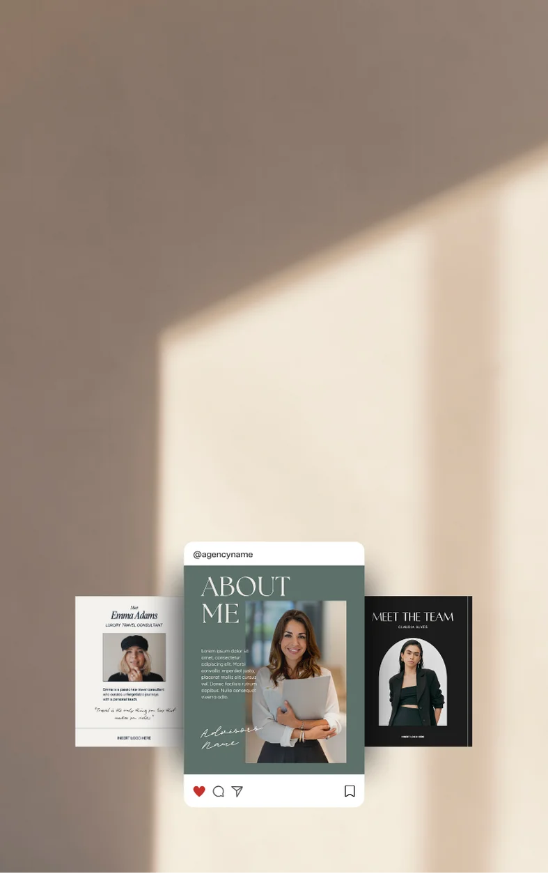
- Website: Use your brand colors, fonts, and imagery style across all pages—especially hero sections, buttons, and navigation.
- Instagram Feed & Stories: Treat your feed like a mood board. Use branded templates, a cohesive editing style, and curated content that mirrors your travel tone.
- Proposals & Itineraries: Use branded headers, consistent type hierarchy, and elegant formatting. This is where visual detail directly influences perceived value.
- Email Marketing: Maintain brand colors, fonts, and your logo. Even email signatures should reflect your visual identity.
- Printed Materials: Brochures, business cards, and luggage tags should all reflect your main brand system.
Each touchpoint reinforces your brand when they all reflect the same visual identity.
Tools to Help You Stay On-Brand
To simplify brand consistency, use tools that centralize, streamline, and standardize your brand visuals. Here are a few that luxury travel advisors often rely on:
- Canva Pro
Create branded templates for social posts, itineraries, presentations, and email banners.- Top 3 Uses:
- Build drag-and-drop templates using your fonts and colors
- Create a saved brand kit for instant design alignment
- Export polished visuals for Instagram, newsletters, or client PDFs
- Top 3 Uses:
- Notion or Google Drive
Keep a centralized hub for brand assets, guidelines, and shared design files.- Top 3 Uses:
- Store logos, hex codes, and font files in one location
- Share quick access links with VAs or collaborators
- Maintain up-to-date brand guidelines
- Top 3 Uses:
- Figma or Adobe Express
Ideal for more advanced, collaborative design work and asset versioning.- Top 3 Uses:
- Develop scalable UI components for websites or digital documents
- Collaborate with designers in real-time
- Maintain a live brand system with reusable styles
- Top 3 Uses:
- Google Chrome Extensions (e.g., ColorZilla)
Easily match and apply your brand colors while designing web content.- Top 3 Uses:
- Identify exact hex codes from web pages
- Copy brand colors directly into other platforms
- Maintain visual consistency across marketing channels
- Top 3 Uses:
Of course, a well-organized brand style guide is the cornerstone of consistency. Make sure yours includes logo usage rules, font styles, color values, photography samples, and do’s and don’ts. A good guide ensures every piece of content feels unmistakably yours.
To simplify brand consistency, use tools that centralize and automate your visuals:
- Canva Pro: Create branded templates for social posts, proposals, and presentations
- Notion or Google Drive: Host your brand guidelines and assets for easy team or VA access
- Figma or Adobe Express: Great for more complex design systems with shared styles
- Google Chrome Extensions: Use color picker tools to pull your exact hex codes when building web content or emails
And of course, having a well-organized brand style guide is key. Include your hex codes, logo variations, typography hierarchy, photo samples, and visual do’s and don’ts.
Common Branding Pitfalls to Avoid
Even with the best intentions, visual consistency can break down. Here’s a quick "Do vs. Don’t" list to help you avoid common missteps:
Do's
Stick to one or two complementary fonts
Mix multiple font styles across platforms
Maintain your original color palette and hex codes
Allow color drift or shift over time
Curate imagery that matches your brand tone and aesthetic
Dont's
Rely heavily on generic or mismatched stock photos
Use templates and design assets aligned with your style
Create one-off graphics that don’t reflect your brand system
Reference your brand style guide often
Design on-the-fly without consistency checks
(Insert Table)
When in doubt, simplify and return to your visual foundation. In luxury branding, consistency isn’t restrictive—it’s a reflection of care and quality.
Even with the best intentions, visual consistency can break down. Here are a few things to watch out for:
- Mixing too many font styles: Stick to one or two complementary fonts
- Color drift: Don’t let your palette shift over time—stay true to your core tones
- Stock photo overload: Make sure images align with your photography aesthetic (e.g., tone, saturation, composition)
- One-off designs: Avoid creating graphics or materials outside your brand system, even if they feel "fun"
When in doubt, return to your style guide—and remember, less is often more in luxury.
Final Thoughts: Look the Part, Earn the Trust
In luxury travel, your visual presence is a powerful part of your brand reputation. Clients often decide whether they trust you—or want to invest—before they’ve even read a word.
By staying visually consistent across platforms and materials, you make your brand easier to recognize, easier to trust, and ultimately more compelling to the luxury traveler.
Majeste can help you create or refine your visual identity so that every visual touchpoint aligns beautifully with your brand values and business goals. Ready to design a brand that truly reflects your expertise?
Let’s bring your visuals into alignment—and elevate your presence with intention.
.webp)
.svg)

